The ChamMedia brand system.
A practical reference for keeping ChamMedia looking and sounding like a premium corporate creative studio — across every page, pitch, and piece of content. Confident, clean, and strategic. Never flashy.
Strategic creative for learning, marketing & communications.
ChamMedia is a boutique creative consulting studio. We help organizations communicate, train, engage, and grow — through branding, multimedia production, learning experiences, and AI-enhanced creative solutions. The brand should always read as a premium corporate creative partner, not a freelance portfolio or basic video shop.
| Attribute | Definition |
|---|---|
| Positioning | A premium corporate creative studio and consulting partner — strategy first, craft always. |
| Core message | Strategic creative solutions for learning, marketing, and communications. |
| Lead offering | Multimedia strategy & creative consulting — we help decide what to create and why, not just produce it. |
| Primary audience | Corporate L&D, HR, Talent, Internal Comms, Marketing, Employee Experience, Leadership & Corporate Communications. |
| Secondary | Churches, nonprofits, SMBs, healthcare, hospitality, legal, coaching & professional services. |
| The takeaway | “ChamMedia understands business goals, not just creative deliverables.” |
The logo.
The horizontal lockup pairs the teal chameleon mark with the CHAM MEDIA wordmark. Use the supplied outlined SVGs so the logo renders identically everywhere. Two color treatments cover every background.


Primary (light backgrounds): cham_media-GROUP_horz_new-t-w.svg — black wordmark, teal mark.
Reversed (dark backgrounds): cham_media-GROUP_horz_new-t-w-white.svg — white wordmark, teal mark.
Clear space & minimum size
Keep clear space around the logo equal to the height of the mark. Don't crowd it with text, edges, or other graphics. Minimum width: 120px on screen (header uses ~168px). The mark may be used on its own as an avatar or favicon when the full lockup won't fit.
✓ Do
- Use the outlined SVGs provided.
- Use the reversed (white) version on dark or teal backgrounds.
- Keep the mark teal (#0E6B63) at all times.
- Preserve proportions and clear space.
- Place on calm, high-contrast backgrounds.
✕ Don't
- Stretch, condense, or rotate the logo.
- Recolor the wordmark to off-brand colors.
- Add shadows, gradients, or outlines.
- Place the black wordmark on dark or busy imagery.
- Rearrange or resize the mark and wordmark separately.
Color palette.
An 80% light / 20% dark system. Warm white and near-black do the heavy lifting; teal is the signature accent used for headlines, links, and the mark; electric blue is reserved for primary actions and highlights. Use accent colors with restraint.
Brand colors
Functional colors
Headline rule: headlines are teal — deep teal (#0E6B63) on light, light teal (#6FE3D3) on dark, white on solid-teal CTA bands.
Typography.
Inter carries everything — headlines through body — set tight and spacious for an executive feel. IBM Plex Mono is used only for small uppercase labels (eyebrows, metadata, numbering) to add a precise, editorial accent.
How ChamMedia sounds.
Professional, strategic, clear, and confident — corporate-friendly and creative without being trendy. Premium, but approachable. We lead with business outcomes, not tools or hype.
✓ Do
- “Strategic creative solutions for learning, marketing & communications.”
- Lead with the business problem and the outcome.
- Position ChamMedia as a strategic partner, not a vendor.
- Use plain, confident language and active voice.
✕ Don't
- Lead with tools (Adobe, Premiere, After Effects, Figma, ChatGPT, Midjourney, Runway).
- Over-hype AI or sound like “just an AI agency.”
- Use gimmicky, salesy, or freelancer-style language.
- Overuse buzzwords or exclamation points.
Core UI components.
Rounded, calm, and tactile. Buttons are pill-shaped with a subtle lift on hover; links use an animated underline; cards lift gently. Motion is felt, not seen.
Buttons
Links, labels & tags
Card
Learning & Development
Helping organizations educate, onboard, and develop their people with content that sticks.
Form field
Imagery & art direction.
Cinematic, abstract, and premium — built from the brand palette with generous negative space. Think IDEO and Pentagram restraint: confident, never busy. Avoid clip-art, literal stock photos, fake people, and unlicensed logos.
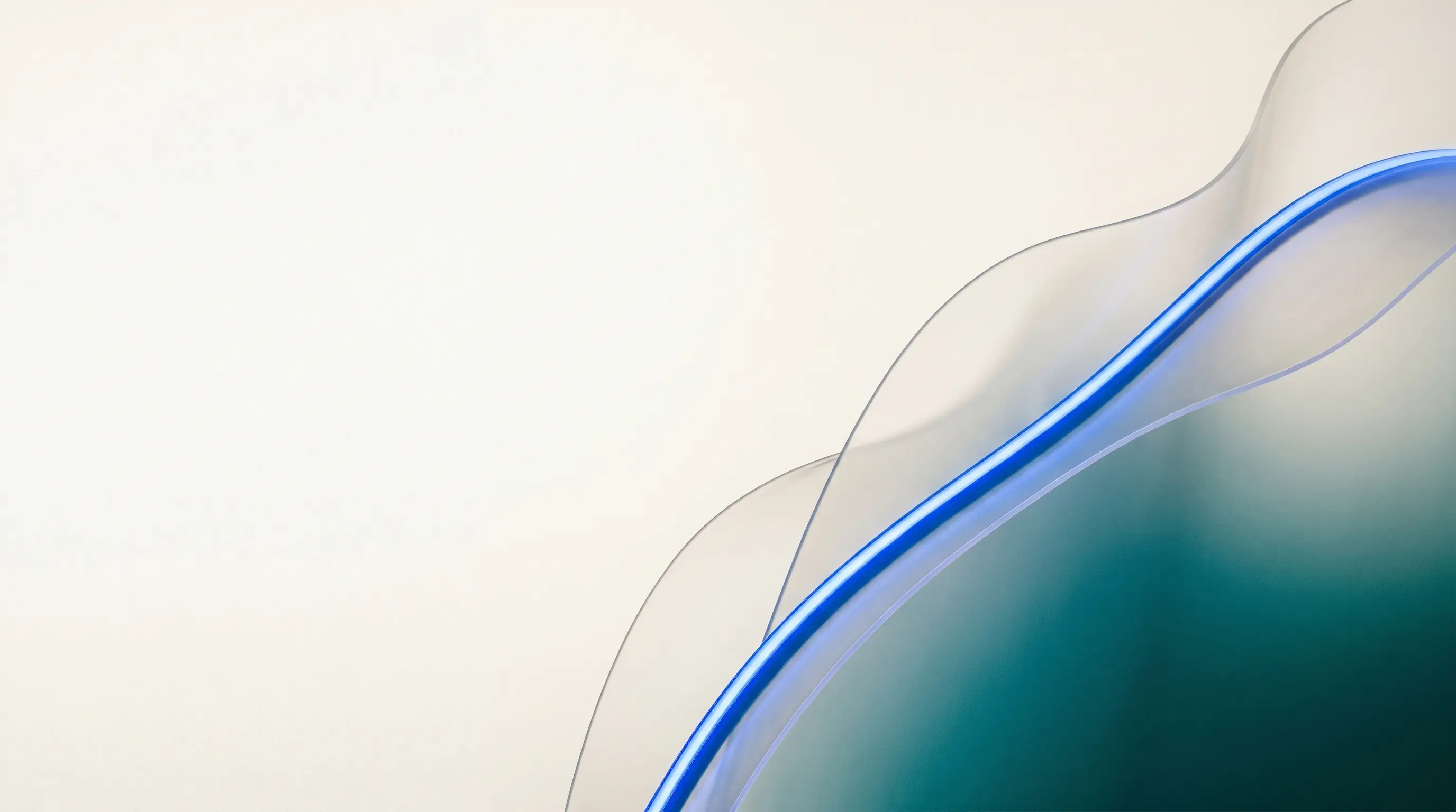
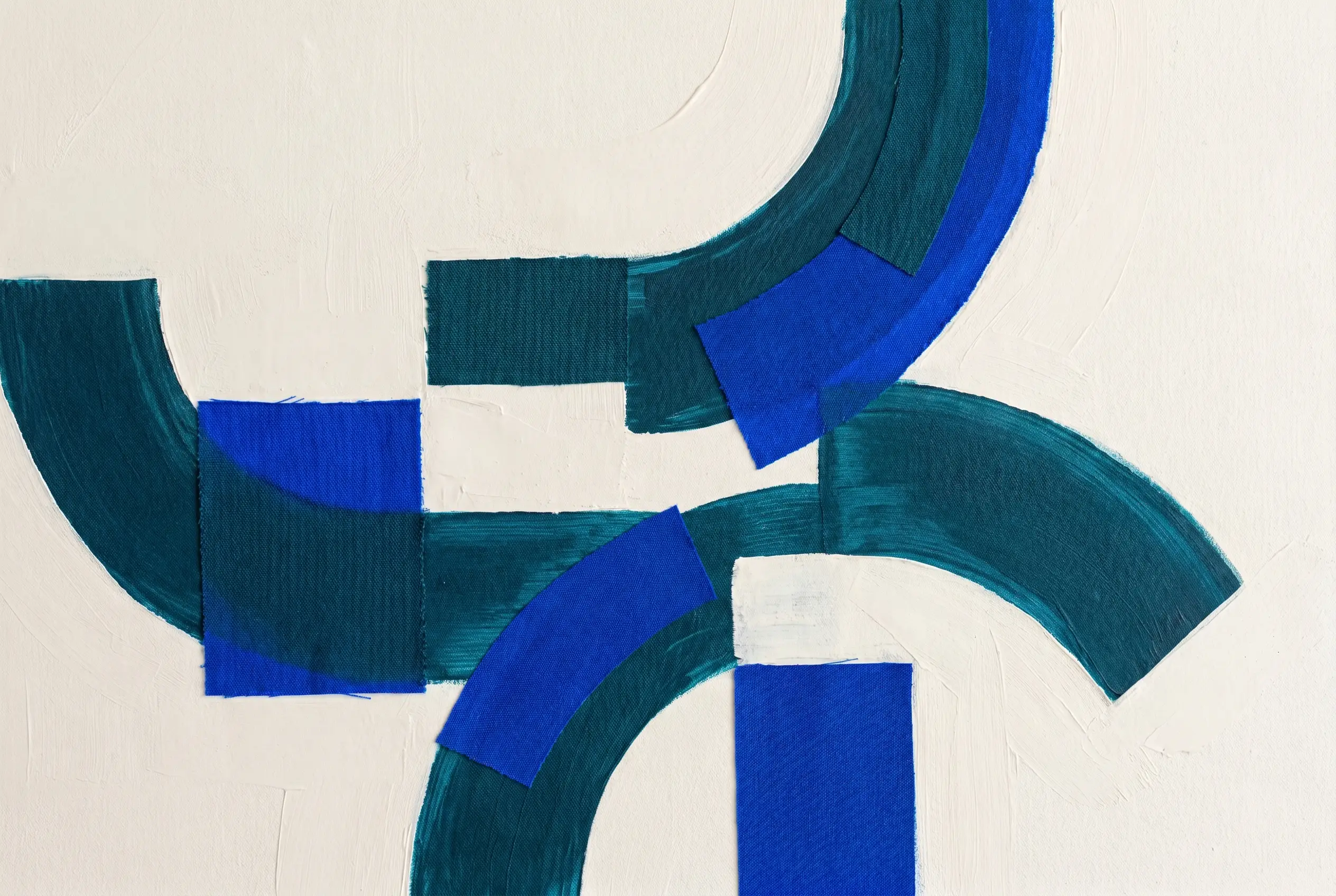

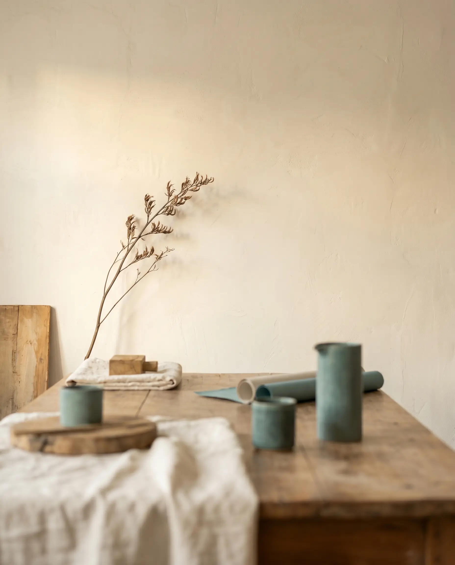
✓ Do
- Use brand-palette gradients, light, and abstract form.
- Leave generous negative space for text.
- Keep a calm, cinematic, editorial mood.
✕ Don't
- Use generic stock photography or clip-art.
- Show fake people or unlicensed client logos.
- Over-saturate or clutter the frame.
Layout & motion.
A wide, airy grid with strong spacing. Motion is strategic and subtle — content rises gently into view, elements lift on hover, the hero drifts slowly. Everything respects reduced-motion settings.
| Token | Value | Use |
|---|---|---|
| Container | 1280px (narrow 880px) | Max content width |
| Gutter | clamp(20px, 5vw, 64px) | Page side padding |
| Section rhythm | clamp(72px, 11vw, 150px) | Vertical section padding |
| Radius | 4px / 10px (large) | Inputs, buttons / cards, media |
| Easing | cubic-bezier(.22,1,.36,1) | Reveals & hover transitions |
Accessibility.
Premium and inclusive aren't at odds. Hold the brand to these baselines.
One brand, applied with discipline.
Use this guide for every page, deck, and piece of content — so ChamMedia always feels like the premium creative partner it is.